A design system was created in Figma for California State University, Northridge.
Role
UI Designer
Timeline
Q2 2022 - Q1 2023
Skills
Interaction Design, UI Design, UX Designer
California State University, Northridge, established that its web presence was outdated and needed to be revamped to stay current. Previously, no design system had been created to assist with the creation of future designs.
Create a design system in Figma to assist with the development of the web revamp.
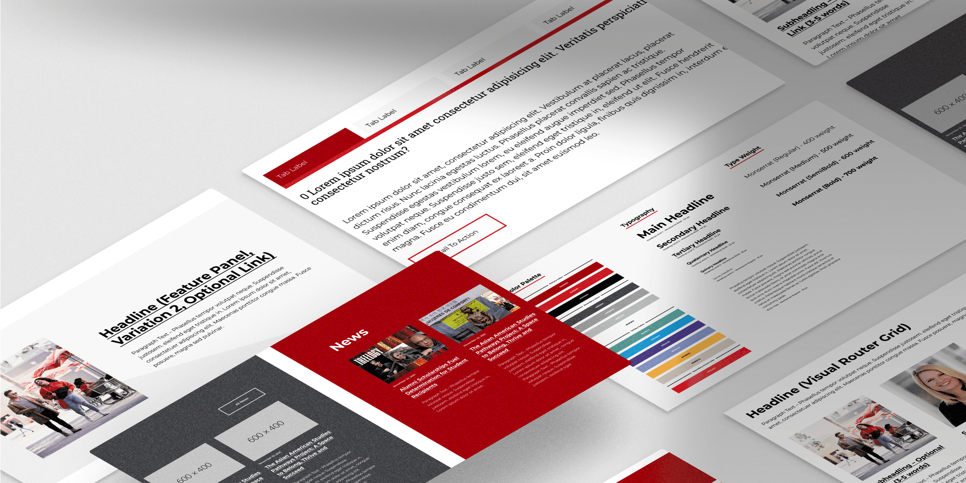
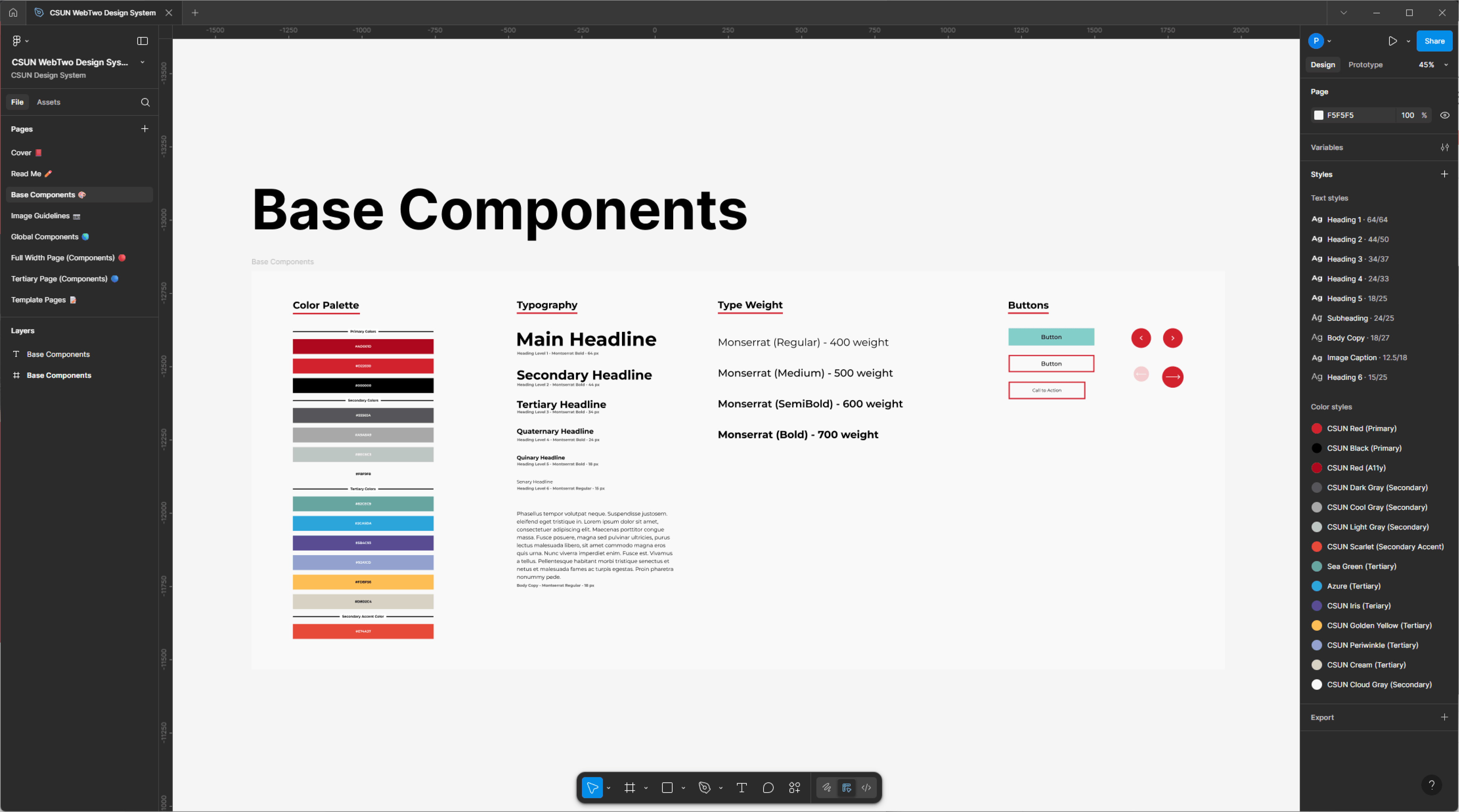
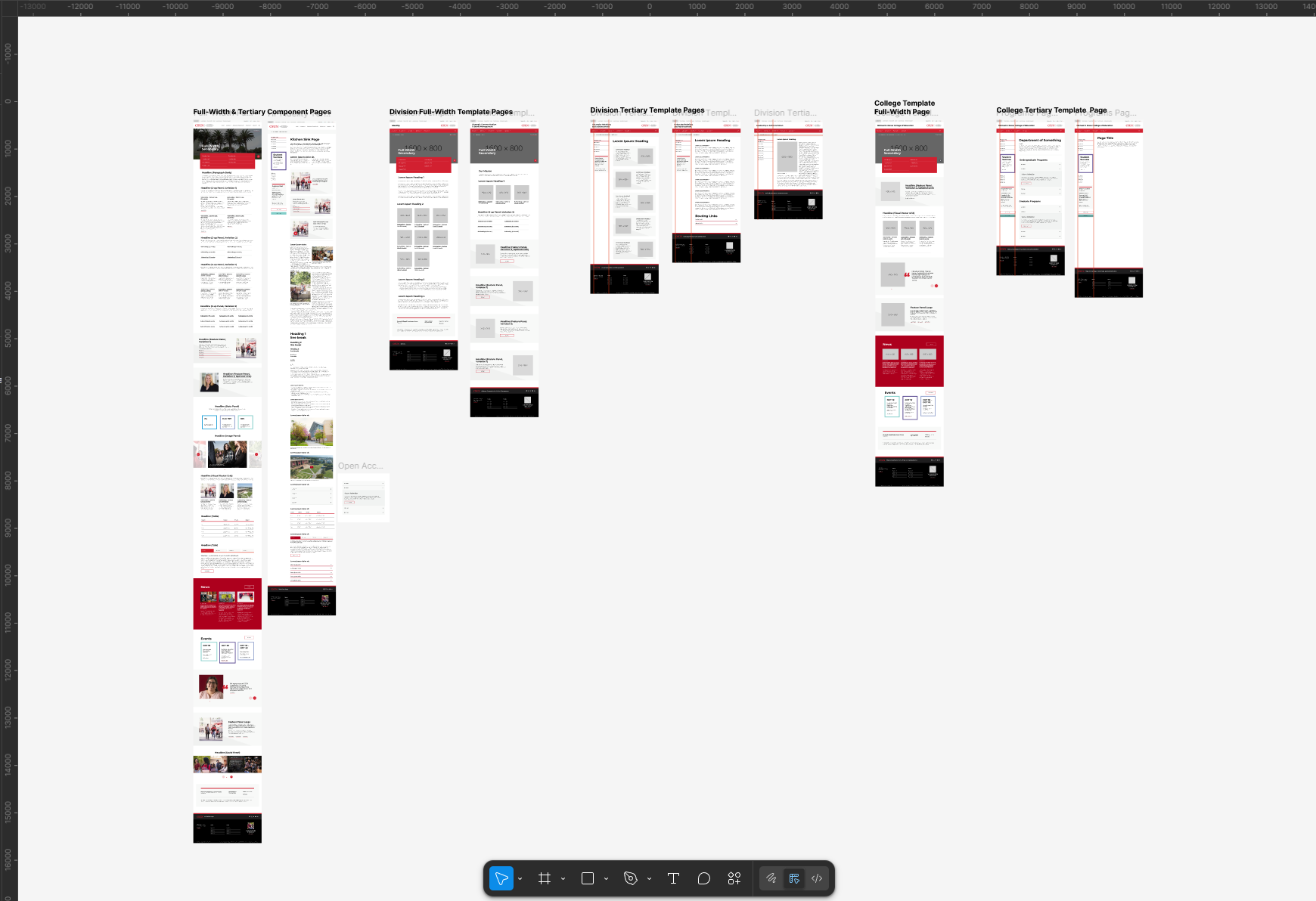
The team set out to deliver a design system that could be used by the whole institution. A design system with clear guidelines that would be easy to use with just one session of training. The university’s current web presence was outdated, and we needed a revamp as soon as possible to create an easy-to-navigate website and welcome new users and prospective students.
Compared to all other CSU universities, CSUN’s website did not have a modern look. The design had not been updated since 2008, while the competitors had a sleek look. One important aspect we analyzed was the landing page of other universities and how we could attract more prospective students to drive engagement to the institution.
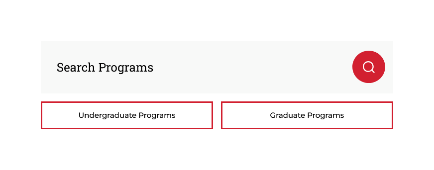
A groundbreaking component for us was designing a program to find. This would easily allow students to search for programs of study at the university. The goal was to drive prospective student rates up.
It would be a lengthy process to redesign our existing web presence using the new design system. With thousands of web pages needing to be redesigned and migrated, we had to make sure campus partners were aware of how to use the new design system and develop the web pages in the Drupal CMS.
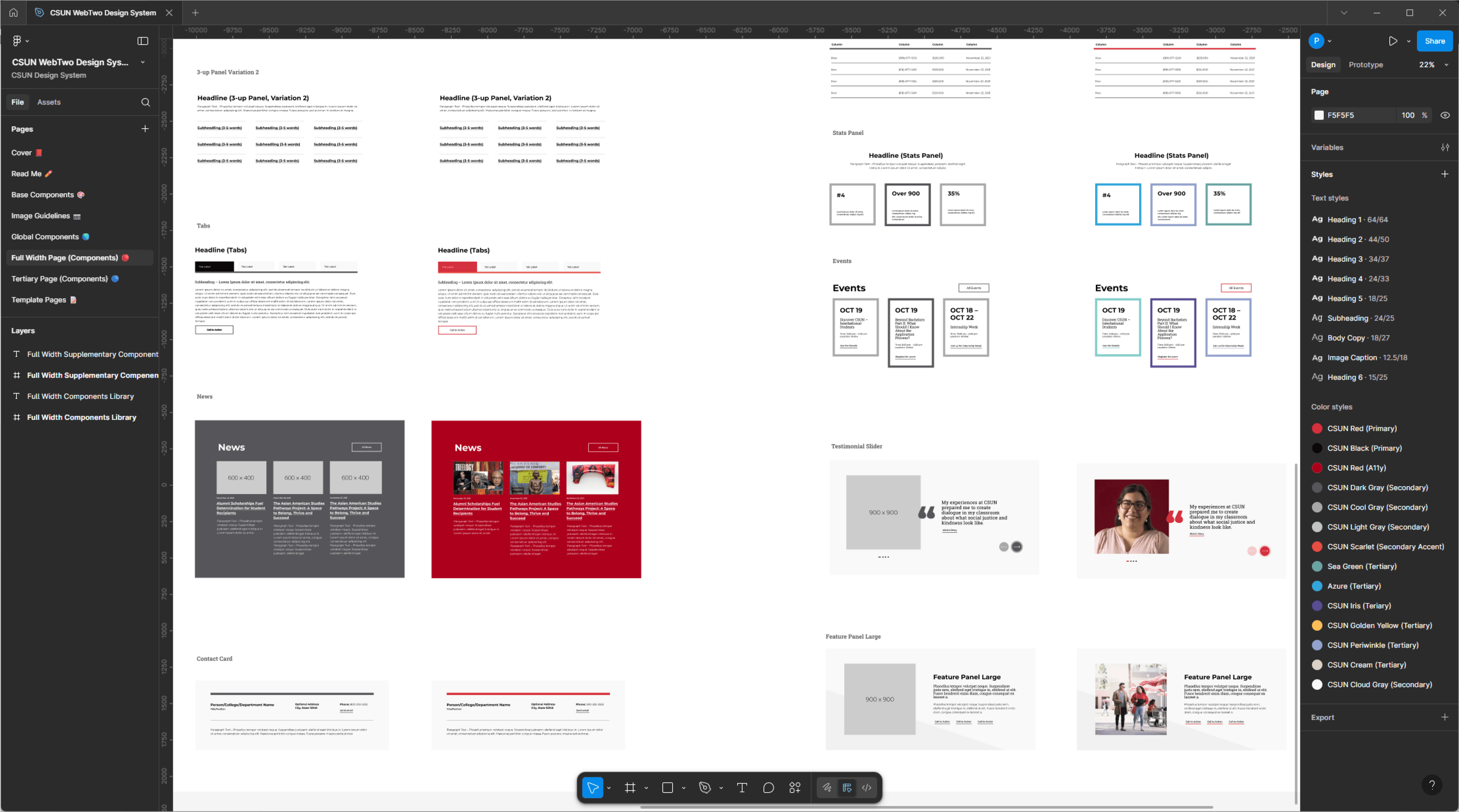
Before rolling out the design system, we hosted workshops and worked closely with campus partners on how to design prototypes and wireframes in Figma using the new design system. We created video recordings and detailed documentation on how to use the reusable components we designed. Campus partners were provided with a local copy of the design system for them to download, where they can experiment and test the design system themselves without breaking the master copy.
Rather than trying to quickly adopt the new design system, we started small by segmenting which portions of our website needed to be redesigned first. We started with the university’s homepage and the top-level pages with the most traffic.


The transition to the new design system was an iterative process. We developed a running list of all the departmental websites that needed to be redesigned. All these websites consisted of thousands of web pages. Once a website was redesigned, we handed it over to the campus partner, letting them know to always refer to the training and workshop or to contact us whenever in doubt about design solutions.
With a design system now created in Figma, campus partners were able to quickly iterate on ideas and present them to stakeholders faster to receive critique. The design system allows for prototypes and wireframing without having to develop web pages that would then have to be redesigned if they were not aligned with user goals.
After the team completed their onboarding of the new design system, minimal quality assurance testing was necessary by campus partners because they utilized out-of-the-box components.
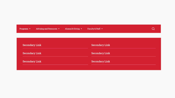
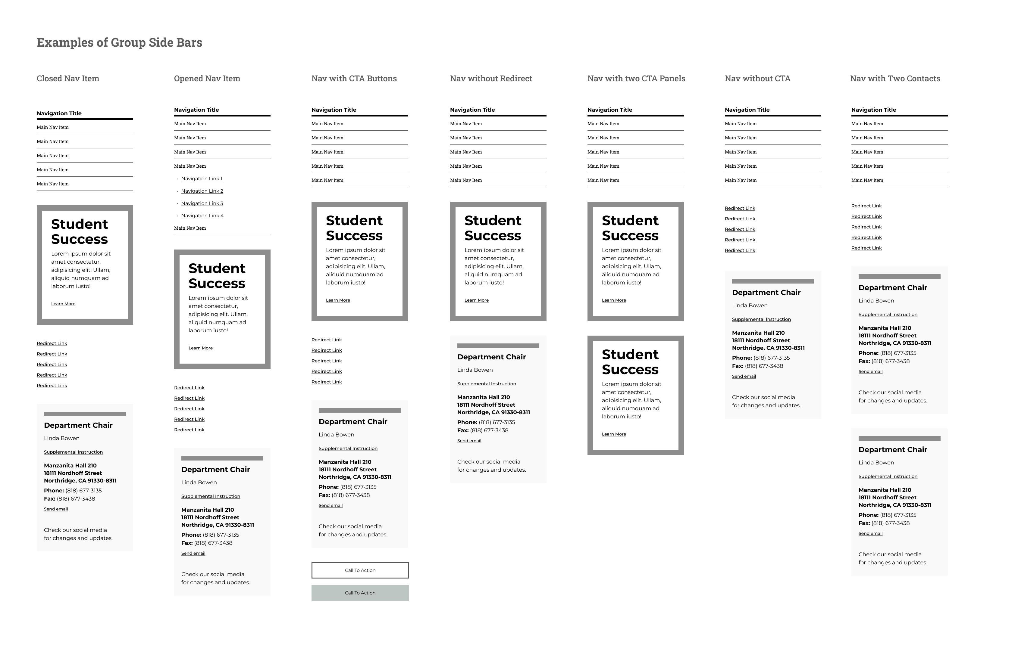
The new design system has improved user navigation between websites and web pages. The hierarchy of how web pages are linked is clear, and users can navigate back to parent categories through the side-bar navigation or the breadcrumbs.
After the redesign of CSUN’s website, the institution reported a 14% increase in prospective students. This has led to initiatives to attract more students and produce more campaigns to continue the increase in prospective students.